Wednesday, April 30, 2008
whachu lookin at?
Tuesday, April 29, 2008
snowmun graphic
Monday, April 28, 2008
show me the munny
One of the classes I decided to get involved with this year was a class simply titled "the toy". Now it's the end of the semester and we are putting on a small toy show of custom toys and custom Munnys. I made a poster for the event that I like. I just hope it's eye catching enough. Originally I was going to put a huge question mark over the blank munny form since eveyone's Munny looks different and people wont really know what to expect, but I think it looks better the way it is now.
Saturday, April 26, 2008
last minute roll out
So as a last minute thing, I went to studio late tonight and printed out a 3'x6' print of my soundfest monsters to hang up for the Soundfest concert tomorrow! I'm really glad I did the art work in Illustrator because it scaled up incredibly well. I wish I could have made more poster art but I guess this will have to be it this time around. Still, it's pretty cool though.
Friday, April 25, 2008
2 plash + strikes again
Thursday, April 24, 2008
rawr
Wednesday, April 23, 2008
shirt details
Just thought I'd post these in case anybody wanted to see what was on the shirt in more detail. I would have posted theses a long time ago but I wasn't allowed to show any images of the shirts before they went on sale and well... now since they are on sale I can finally show these off. If you would like a higher res version of any of these to use as a background just let me know and I'd be glad to send you a copy.
Tuesday, April 22, 2008
kind of a big deal
So this is kind of big deal. I was commissioned to do the visual work for the 2008 football season for Virginia Tech's number one selling shrits. The orange and maroon effect shirts. On the Orange Effect I ended up doing more of a vintage look using hokie stone texture in the big VT on the front and an Old English font and I carried that older look to the back by doing a simple old school football helmet. For the Maroon Effect, it ended up playing off the political idea, not only because 2008 is an election year but because that particular game, the Maroon Effect game, is in November right before elections. From what I understand from the bookstores the shirts are selling really well and people seem to like them quite a bit.
I guess the real bragging though is that I am the first student to get to design these shirts. Usually the print company just has in-house person do it. Also it's a big deal because between 110,00-120,000 shirts will be sold. That's pretty awesome. I can't wait to see the football stadium full of fans wearing the shirts I worked on :)
On the down side though custom tags on the shirts say nothing about a student doing the graphics. It just says that they were designed by SGA (student government association) who in fact did organize the shirts but commissioned me to make. Also it turns out that the shirts were announced at the Spring Game last Saturday and due to poor communication I missed their launch, which is a pretty big let down. And get this I don't even get a set of the shirts. I have to buy them, which I would if SGA ever gets around to compensating me for my work.
But to end on a good note I am really proud of the fact that I did get to work on the shirts and that they seem to be a pretty big success.
Monday, April 21, 2008
so orange
I stumbled upon these awesome speakers while surfing to see if any pics have surfaced of the VT crew over in Milan. Just goes to show not all things at the furniture fair are not super serious design. I love these speakers and really want to figure out how to make a set of my own. I found this via designboom weblog. Maybe my friend Brad could make a set...
I'm lovin Discovery
Have you seen the new Discovery channel ad? It's just awesome. I don't know if I like it because I've been watching more Discovery lately or if I like it just because it's a great commercial. Probably it's just because it's a great commercial is my guess. That and it has Steven Hawking singing "boom de yadda".
Also has anyone noticed that Discovery changed their logo this month? This is the new one that went into effect April 15th.
Sunday, April 20, 2008
tryin out some new things
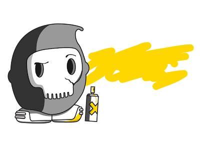
So I decided I should try out some new things. One of them being use Illustrator more. I'm still figuring out some things about it. Like, I don't understand why any file I export (jpg. bmp.) looks right on my computer but as soon as it goes online or in an email the colors invert. It seems like png. is the only export file that has the colors stay the same when put online. At least that's what happened with the pic of the little skull dude. Like I said I'm trying out some new things because I'm a photoshop junkie and, well I'd like to be equally as good in Illustrator. So here it is. My first color picture done solely with Illustrator. The pic on the post below of the soundfest monsters I did pen in Illustrator but brought into photoshop for the background as well as being able to place it on some shirts so the printer would know where to put it. And as a side note, my mouse broke so I've been doing all this stuff lately just with the track pad. It's been a little weird but I think it's becoming more natural.
Friday, April 18, 2008
they be jammin
Remember that sketch I put up a little while ago of some monsters rockin out? Well here's what it's become. This is the graphic for the Soundfest shirts. Hope you like it :) I think it turned out alright. I especially like the new guy on the left.
Thursday, April 17, 2008
its a crazy small world
How crazy is this? I just learned that the guy who runs geekologie lives in Blacksburg and works at Tech. It is unfortunate that I learned of that because of the April 16th tragedy but I found his post about it very personal and respectful. I am thankful for his words.
Wednesday, April 16, 2008
16th
As many of you know, last April 16th was a terrible day at Virginia Tech. A lot of lives were lost for no good reason and one of those lives was one of my close friends Ryan Clark. It has taken me a long time to be able to talk about it but now that it's the 16th again I can't help but think of everything that's happened. I really miss Ryan, and I know I'm not the only one.
As what almost seemed to be a gut reaction, at the time, the school made, those now well known, Hokies United shirts. It was a great gesture and a way for people to bond and show each other support but I couldn't help but feel that the shirt totally missed the point. I never got one because I didn't want people to look at me and feel sorry and ask me about the whole ordeal, especially since I lost someone dear. Anyways, because of that I decided to come up with my own shirt and it's my hope that it might someday be made in remembrance of the ones we lost, the strength of the virginia tech community and how we are stronger and moving towards a bright future.
Here's what my shirt could look like. I got the idea after seeing pictures of all the balloons being released on the drill field in honor of all those that were lost. There are 32 balloons, one for each person, and they are being lead up to the sky by a white balloon. I feel that this is the least I can do to help bring closure to not only myself but to others as well.
Tuesday, April 15, 2008
look, its me!
Monday, April 14, 2008
sweet spot
There's this little alleyway between the UPS store and The Chocolate Spike that leads onto main st. where Mish Mish is. Anyways, today on my way to Mish we found this little jem of what used to be a UPS sticker and is now much better as a Johnny Cupcakes sticker. Yeah, 2 plash +, I totally called you out. Keep doin what you do but make it original. Blacksburg could use some more sticker graffiti.
Giant Squid!
This my friends, this is a giant squid. It's over 6 feet in length and about 20lbs in weight. The big guy started out as a 6'x8' canvass that numerous people printed on over the course of the semester. The prints really had no rhyme or reason to their placement so it came out looking really interesting. I ended up taking it and using just about every square inch of it in making this squid. It took about full day of sewing by machine and by hand to get it done and yes, it has 10 legs. I got a lot of help from my girlfriend Ashley with sewing on the eyes and bringing the whole thing to life. I really love it. It's currently on display in Surge. If you get a chance to go by and see it give it hug. I bet you'll like it.
Saturday, April 12, 2008
making things is better than growing up
This is Ken. Ken is a silkscreen fiend and one of the best guys I know at it. He's been making large prints all semester and they just keep getting better and better. But to the point, Ken is amazing and I am teaming up with him on my first silk screening colab. I don't have pictures of it yet because it's still in the works but I'll be posting pics in about two days when the piece is done.
SAR
Some Assembly Required went down last night in the south end zone of Lane Stadium and it was a blast. I had a really good time hanging out with the designer kid crowd and professors. There were pigs in a blanket, meatballs, cheese trays, beer, wine and more funny conversation than you could shake a Phillippe Stark fly swatter at. It was also great seeing my graphics from the posters reused for signage at the cocktail. On top of that I had the best looking date there. All night I was getting compliments about how great she looked. I did my best to keep up with her, I mean I was sporting french cuffs all black and a killer solid aqua tie to match her dress. But what can I say it's hard to keep up with your date if shes a blond with killer eyes, a knockout dress and is a good conversationalist. Guess I should stick to the blogging haha.
3,600 should be enough
Tomorrow 3 professors and 12 students are heading over to Milan Italy for the international furniture fair. They're actually one of the groups displaying in the giga-complex that is the Milan Furniture Fair. And when I say "giga" I mean huge. This thing is miles long in each direction. I really hope it's a success for them since it is the first time the school has gotten a booth there.
Before they could go though, there was a lot of work and details that had to be taken care of. My end of all this was developing a graphic for the group that would be used on the cover of all the pamphlets they'll be handing out at the show as well as making everyones' business cards. Granted I have made myself business cards before, this has been my first "real" business card for a client. After a lot of hard work, phone calls, revisions, last minute tweaks and many trips to the print shop the cards are done, and they look stellar. Everybody loves them and I got a lot of pats on the back for them. I'm just happy that everyone was so pleased with my work.
As far as the details go I ended up making a total of 3,600 cards. Thats 240 per person and I had to print them out myself. I got the paper from a print shop, printed them (with numerous test prints) on a color laser printer, sorted them, took them back to the print shop to be cut down to size and boxed, then finally delivered them. If you look closely the plus symbol on the front lines up perfectly with the plus symbol on the back. Originally I wanted to have the plus stamped out of the card but it turned out that the shape was too small to make a die cut for and there wasn't enough time to send them out to be laser cut. In the end though it didn't really matter because they still look professional and like I said in an earlier post, one or two of the professors may be making these their new personal business cards because they don't like the standard issue cards the school gives them.
I printed 24 cards per 11x17 sheet on 100lb bright white cardstock.
Friday, April 11, 2008
piggy wallet print
I'm just finishing up my year as Graphic Design director for VTU and this is one of my last projects for them. At the end of every year all the active members get a gift. This year someone decided that these card/coin holder thingies were a good idea. Anywho, regardless of that I tried to come up with a cool print to put on them. I think it looks pretty good especially since it still has a little bit of a hand drawn look to it. I ended up using Illustrator again but this time I also used my Bamboo tablet to do the scratchy shading. I hope everybody likes the print, I mean come on, it's way better than the standard VTU logo from the 70's.
Thursday, April 10, 2008
squid
I think this latest pattern is pretty cool. One, because it's squids and two because it's the first real drawing I've done solely with Illustrator that I really like. So I printed this on about a 2'x 2' piece of cloth and I'm going to be taking it and turning it into a squid and if there's enough material left maybe a little whale too because I think that would be ironic.
Wednesday, April 9, 2008
Kraak & Smaak
I love this song and the video that goes with it. I found it via NOTCOT. I'm hoping to have some time to see if the rest of Kraak & Smaak's stuff is just as enjoyable because I keep replaying this throughout the day. From what I hear though, this particular track is really similar to what the Boogieburg guys do. I guess I should check them out too, I mean they play locally all the time and I've never really gone to see them, hmmmm.
color stage 2
Subscribe to:
Posts (Atom)